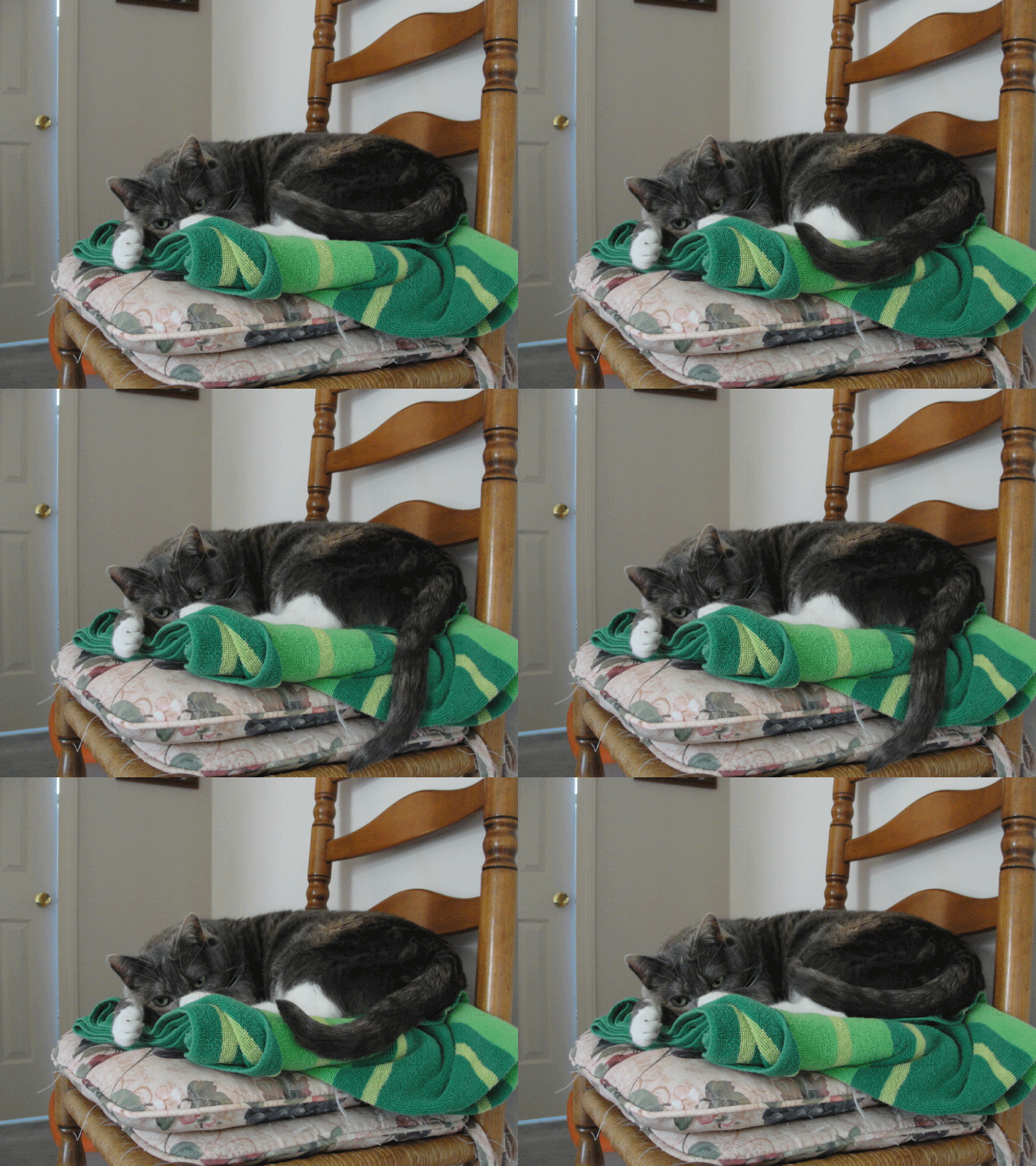
I origionally planned to photograph one of my cats when they were actually asleep, but this one was sitting in a good pose/spot even though she wasn't yet asleep (and she got a bit grumpy when I started moving her tail). I thought this would be a good one to make since cats are something that tends to move around a lot, or at least continually shift when sitting still. She rolled a few times while taking pictures, and didn't want to keep her tail in certain positions (mainly anything that wasn't up against her or haning straight down). The cinemagraph ended up well, though more frames for a smoother transition would've been better
I had origionally planned to put a whole person in the picture, but learned that it is a challenge to type in a way that doesn't move most of the arms. Sometimes you'll see things where it seems like somebody is typing super fast, and this is like a reflection of that. The camera apparently moved sometime during the process of taking pictures, despite the fact that it was set on a solid surface and only had the button pressed one, in a mode to continuously take several pictures. There's one time where the front hand seems to blip forwards, but otherwise this cinemagraph is fairly good, and there's even one person in the background that is noticably frozen mid-movement (and the guy infront of the frames looks kinda like a picture if you don't look directly at him)
Friday, November 30, 2012
Monday, November 26, 2012
Cinemagraph Ideas
My second cinemagraph will be of a person typing. Only the fingers and hands (nothing from the wrist up) will move, and I'll either photograph somebody in class on the computer or get my sister to help on her laptop at home. This may need anywhere form 2 to 6 photos, and only the body (excluding hands) should need to be erased, unless there is any background movement
Tuesday, November 20, 2012
Friday, November 16, 2012
Gradient Duck
I don't like using making an image fully of gradients, though this did let me figure out how to change the size and shape of a radial gradient
Thursday, November 15, 2012
Adobe Illustrator Flowers
This program makes it easier to apply gradients from specific areas (like the center), though I'm mostly unfamiliar with the program for now. I dislike the way it sorts layers so far, as I've only found options to move one layer deeper/higher or directly to the top/bottom, without indication of what layer the objects are on. The objects also seem to get in eachothers' ways while while trying to select only one or a specific group
Book Cover Design
I chose Kurloz to draw because he's one of my favorite characters, along with being more newly revealed, so I hadn't really drawn him yet
Homestuck is a piece of multimedia that doesn't have any genre that fully covers it, though it is normally referred to as a webcomic. The story is mostly seen in a game-like style, sometimes talking directly to the reader and/or becoming extremely meta. There are many settings in Homestuck, including houses, forests, different planets, different universes, voids, places that completely disregard and concept of rational timespace, dreamworlds and more. There really is no set mood either; it can be funny and humorous (Hussie also includes the readers ideas in the story, often picking up jokes made by the fandom and making them show up once in a while), serious, dramatic, heartbreaking, or just plain confusing
The first cover reflects the more joyful parts of the story, with several of the characters from Beforus together, alive. The second cover reflects more of the darker side of the story, showing the design of the strongest enemy/challenge in Homestuck (so far), along with showing strength through the god-tiering.
The first font was used to seem more like Alternian/Beforian text, since some cannot read Alternian without a guide for translation. The hemospectum was also added into the text, for having a large influence in that xenoculture and being noticeable to Homestuck fans. The second font mimicks the text used in strifes, showing a battle ahead
Thursday, November 1, 2012
Subscribe to:
Comments (Atom)


